
1970s interior decor was colorful, energetic, and at many times, just downright kooky. For this, it was popularly known as the ‘decade that style forgot’ but in the past 5 years, it seems like its design ethos is becoming more and more remembered. People are painting big stripey murals, we all want an interesting couch, every other instagram account on your feed (at least on my feed…) is selling vintage glassware. And let’s not forget that the Dumbo location of The Wing included a green velvet take on the classic 70s conversation pit. But we all know how that ended… The intersection of that conflict and design revival alone leads me to wonder, is this 70’s moment just another passing micro-phase? Will the comeback of the conversation pit and all the other 70’s fabulousness die along with the #girlboss era, or can some of these modern incarnations be designed to last? In honor of this design crossroads, we’ve decided to put in our two cents on some of the 70’s finest interior elements.
Monochrome

Claire: This room tastes like a Shirley Temple and that is good. Big Bond Girl vibes, especially in that wicker armchair. If someone served me a disgusting, old timey cocktail in here, I think I’d actually enjoy it.
Helen: This room makes me feel like I’ve just strolled into a big sore throat, only, I’m wearing fantastic platform boots and a man with obscenely wide lapels is greeting me at the door.
Kate: If a David Lynch-ian red room was in an upscale office building. This room is a limbo. I think I made an appointment to be here? I’m waiting for someone? Who am I waiting for? What’s behind the big curtain on the wall? Why is this pillow shaped like a triangle?

Helen: The only thing that makes a conversation pit even more elite is shag carpet, obviously. And what makes said carpet elite? Technicolor. This pit is God tier.
Kate: I am 100% in favor of bringing the conversation pit back. Like RIGHT NOW. And floor cushions!!! Why aren’t we having more fun with floor cushions any more?
Murals
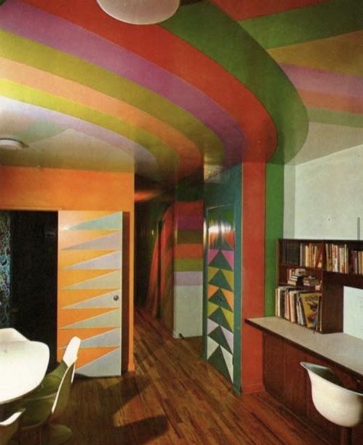
Claire: I don’t know any other way to say this, but this place looks sticky. Like it’s a Montessori preschool.
Helen: I feel like we’re all going to look back on the painted arch trend happening in homes around the country currently and feel similarly to how I feel about this room. Which is, I see where they were coming from. Next!
Kate: While I don’t fully hate the energy that is going on here, it is a lot. There are too many directional lines like its trying to guide me through an airport terminal. I would just like to be stationary in my own home plz.

Claire: This is the kitchen EPCOT used to make ‘The Land.’ I’m obsessed. I, too, want a tropical pastel kitchen with bamboo shades. You just know the breakfast plates cooked up in this kitchen (hash browns, sausage links, sunny-side-up eggs, tall glass of juice) come out perfect every time.
Helen: Big bold beautiful yes, 10/10. But only if this is, like, my vacation rental in the desert somewhere.
Kate: TEMPTING! If I walked into someone's kitchen and it looked like this I would freak out. I would absolutely think they were the coolest and most interesting person I've ever met. But could I ever commit to doing this to my own kitchen? That I don’t know. I do agree that if I had a vacation rental this would definitely be the move.
Pattern Repeating

Claire: Florals are back in these days. I hope they never go away again. That being said, there’s too much going on here for my tastes. The bedside table here is semi-spacey, the lamps look like peppermints, and the bedskirt, like all bedskirts, is a little much. It also looks like the quilt is the kind that is shaped like a box, with piping to keep it in shape. How do you sleep under a box-shaped blanket?
Helen: This is so so silly and yet I can’t get enough of the floral print. The headboard looks like a building in Midtown. The lamps look like 2013 IKEA. It’s a pass from me.
Kate: Yes to the matchy matchy! What happened to picking one print and then using it for EVERYTHING. I am also for the pattern mixing that is happening with the florals and the striped lamp shades. I’m not convinced that this headboard wouldn’t look like a DIY gone wrong up close and I am generally against a bedskirt. As the others pointed out there are some very strange details here, including what seems to be one long pillow in one long pillow case. Am I just not seeing that right because the florals are so distracting? Or was this a thing? Disturbing.
Hot Pink

Claire: At first glance I thought this was a girlboss butchershop. I’m curious about the small devices on the table. An egg cooker? And a little trough?? Does it seem like the island is backwards and the overhang/chairs should be on the other side? Overall, I find this room unsettling. Let me out, please.
Helen: Hard pass on any purple-toned pink. Be pink or be orange shag carpet. I wouldn’t be able to go anywhere in this room without hearing a clickety-clack, and that bothers me.
Kate: Brown and pink floral reminds me of clothing i got from Limited Too before it turned into Justice in a way that sends a shiver down my spine. Pink has made a comeback in interiors in recent years but there is a reason that this pink has not.

Claire: My American Girl doll grew up here.
Helen: Marsha, Marsha, Marsha!
So...what do we think?
Claire: I’ve been saying this for years, but we need to get back to Bond Girl aesthetics. Spaces that are too much, too over the top, yet somehow minimalist. The first room goes big on color and shapes. Yet the actual pieces of furniture all have space to breathe and speak for themselves. That being said, if we can’t go spy seductress, let us at least go campy with a safari kitchen or a conversation pit. These, too, are over the top, but in a more playful way. Basically, we’re not doing enough. More, I say! More!
Helen: Although I imagine they are huge drains on the construction budget, I need conversation pits back in our world. Isn’t that just the logical next step from the open-concept workspace? Don’t big tech companies want their staff co-mingling in style? Also, monochrome. I want more monochrome.
I, for one, am glad that we can all agree conversation pits should come back. Only time will tell if these some of these trends are here to stay, in the meantime...time to keep scrolling that vintage glassware bbs 😘
xoxo Kate


No comments:
Post a Comment