Pretend Vacation: style
Showing posts with label style. Show all posts

I'll Be Dressing like 90s Hugh Grant this Summer, Here's Why

Thursday, May 27, 2021 0
I'll Be Dressing like 90s Hugh Grant this Summer, Here's Why


    As summer comes back around and the excitement of the change in temperature and the departure of seasonal allergies wears off, I am left standing in front of my closet contemplating how boring all of my summer clothing is. While this isn’t a new phenomenon, this year my brain seems to be more scrambled than ever. I just feel like this year the landscape of summer trends is just sensory overload to the extreme and I don’t know where to look. Scrolling through Instagram is like being in the grocery store right before a major holiday. Just! Too! Much! Like I am loving the comeback of chunky shoes and funky prints everywhere as much as the next girl but it is getting hard for me to tell what I actually genuinely like or if I’ve just been hypnotized by the checkerboard print and I will wake up one day in August and not recognize myself. I’m realizing that I just need a look that will cut through all of the noise while still making me feel cool and comfortable this summer. Which is why I’ll be taking all my style inspiration this summer from rom com Hugh Grant and also a little bit of real life 90s Hugh Grant. 


    Maybe my reaction to the contemporary overwhelm I feel in relation to fashion that has me going back into the past. Or maybe it’s the fact that any 90s rom com is my go to ‘I am sad today’ movie. But I’m always fascinated with Hugh Grant’s styling choices. How they dressed him in literally every movie I think was intended to be slightly heinous and unfashionable. As we all probably know he played a sort of plucky, uncool, but unabashedly charming character in most of his filmography, and many of his wardrobe choices were meant to reflect his slightly out of touch nature (ie the oversized floral button up and shorts). But at the same time that they tried to make him look kind of bad, how great is that energy. I, personally, would love to be a little out of touch!! In contrast, 90s Hugh Grant as captured by the paparazzi was known to be very cool. A kind of cool that toes the line between classic and preppy posh boy (ie khakis and Raybans). So if I’m doing the math right...Trans-Atlantic preppy plus a goofy cut and print equals me looking effortless in a sort of nostalgic and just offbeat way this summer without having to buy a single strappy top with a slightly psychedelic print? Something about the aura that both his movies and celebrity give off to me makes me suddenly feel like there is hope that I won’t be dressing like the most boring person on the planet this summer. I can put on my blue and my white and my denim and maybe it’s actually...a look? 


    While you may think that the look I have proposed is genuinely Not Good, that is okay. Go forth and conquer the summer trend of your choosing. I think it’s really the thought behind the inspiration that can help us all. Summer dressing is hard. It’s hot, there is little room to add interesting layers. Find an idea that sparks a mental moodboard and run with it. Oh and even though I said the trends were overwhelming, I will certainly be adding a beaded necklace to every single look this summer. That is something I can focus on.


-Kate


Where Did All This Cow Print Come From? A Texan Investigates

Wednesday, February 03, 2021 0
Where Did All This Cow Print Come From? A Texan Investigates
 As we collectively recover from the most recent wave of western wear in pop culture- see this rundown on Yeehaw culture- I am still enamored with cow print and the ways in which it has been abstracted to suit the stylistic needs of the Internet Age. While cow print is just one piece of the Yeehaw puzzle, its role in fashion began well before 2019’s cow craze.

Functionally, cowhide has been a valuable resource to humans since prehistoric times. Usually, it was more about the durability of the leather than the fun splotches of the hair on top, so the pattern would not have played a huge role in the shelter and clothing that cowhide was typically used for. In North America, the Plains Indians especially made use of cowhide, adopting it into their leather circulation once cows were introduced to the continent by white colonists. The Plains Indians have also used cowhide to make shields for battle, often painting the shields with protective symbols.

The patterns of cowhide- visible when the hair is left on rather than removed- are more visible in the traditional crafts of the Zulu people in South Africa. Historically, the Zulu people have used cowhide for clothing and accessories like skirts and loincloths. The most distinctive use of cowhide among the Zulu, however, may be the Nguni shield. 

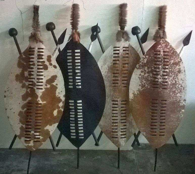
The traditional shield is named for the type of cow it comes from, as well as the language group under which the Zulu language falls. Typically almond-shaped, the shield’s display of unique cowhide patterning was used in battle to distinguish between ranks. The rarer hides, like plain white ones, were reserved for higher ranks, and more common spotted hides indicated regular soldiers. The shields were also thought to provide spiritual protection, much like the painted shields of the Plains Indians. Today these shields, along with other traditional crafts, serve a more ceremonial purpose, appearing in weddings or funerals rather than battles.

Four almond-shaped cowhide shields leaning against a wall.

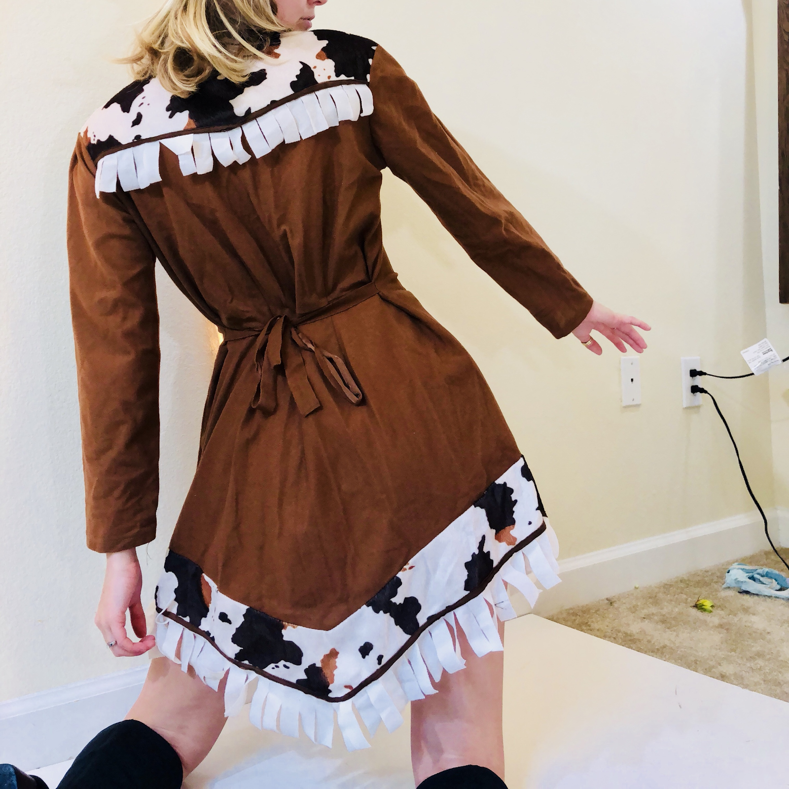
Zooming forward to the 20th century- cowhide became widely associated with the Wild West, as cowboys created their own tools and clothing which were durable enough to survive long cattle drives and protect the intrepid wranglers from thorny flora (think leather chaps). Heavy as it is, cowhide doesn’t really have a role in fashion beyond the highly practical, so cow print became an emblem of the West, as little as it actually appeared in authentic western wear. Until the late 1980s, cow print was little more than a hokey addition to costume pieces. 


The 20th century moved gradually towards the mainstream use of cow print, but Prada cemented its position in high fashion in their 1991 spring/summer collection. The collection delivered unto us a total of six cow print pieces, including a bodysuit, two miniskirts, and, unfortunately, a tunic.


Like clockwork, cow print made its way from the runway into the wardrobe of one Rachel Green, who sported this coat in a throwback that would have been set in 1994 (the actual episode aired in 2000). 

So the nineties made cow print an acceptable- trendy, even- pattern to wear. Then, during the late 90s/early 2000s Y2K era, society was blessed with its first Yeehaw wave (yes, a whole twenty years before “Bitch I’m a Cow”). Pioneered by Black creatives, especially in the R&B and hip-hop industries, all of western wear became a costume, with bright colors, cowboy hats, sequins and cowboy boots lighting up countless red carpets and afterparties. Luckily for us, the rich history of the “Black Yeehaw agenda” is well-documented by journalist Carla Aurelie, art critic and writer Antwaun Sargent, and the expertly curated Instagram page, The Yee-Haw Agenda.


Like most major trends, we need to pay due diligence to the pivotal role that Black creators have played in creating the contemporary western aesthetic. Ever since the heyday of literal cowboys, the legacy of Black figures in western wear (and culture) has been overlooked, but it is finally getting more of the attention it deserves thanks to the aforementioned writers and critics, among others.

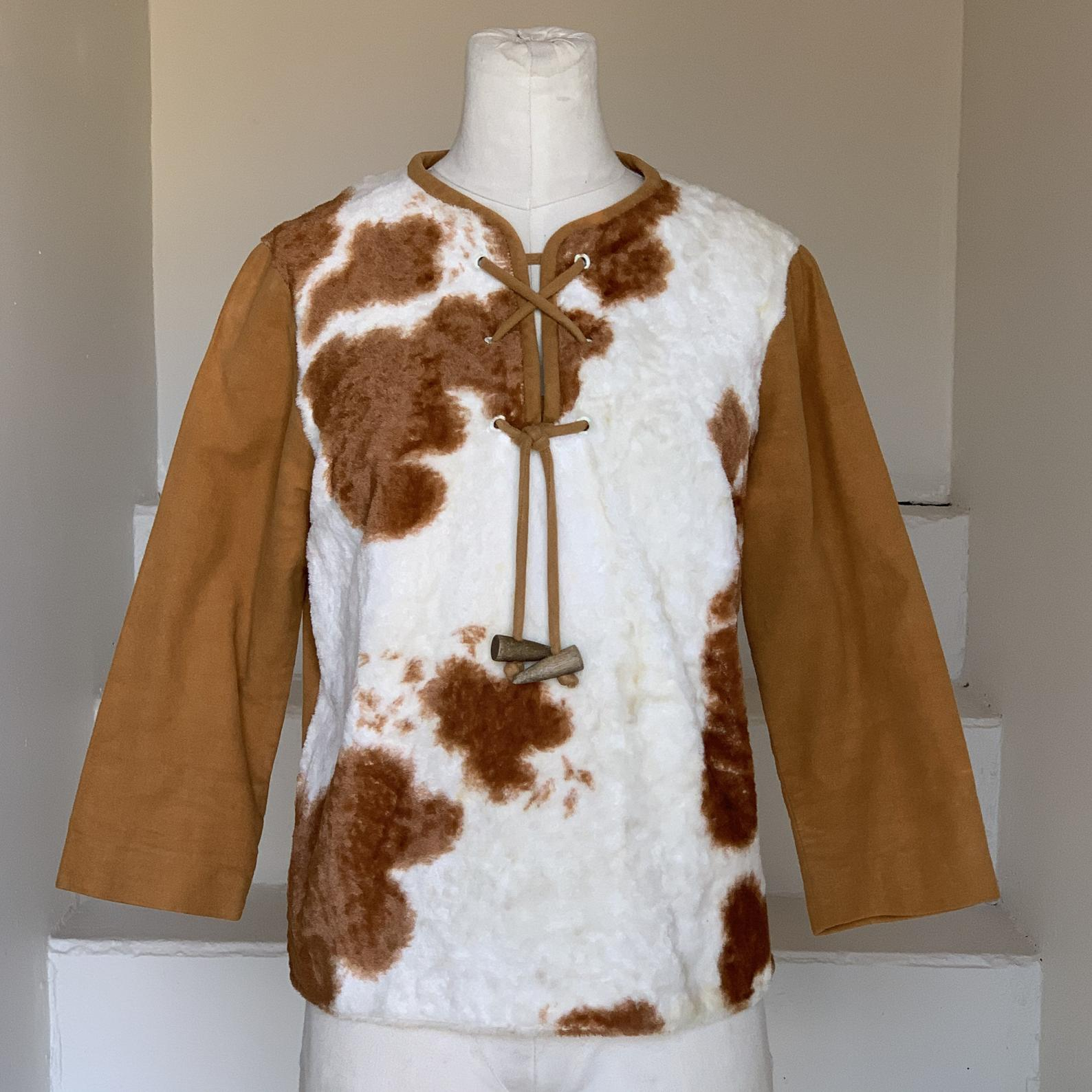
The second Yeehaw wave started in 2019, as the fashion cycle began revisiting the 1990s, and pop culture began to embrace- even reclaim- western style and culture. This period also saw a reworking of the country music genre, traditionally tied to conservative, rural values, to fit a younger, more diverse, and especially more liberal generation. Importantly, this country-pop renaissance was led by woke, queer, and/or LGBT-allied artists like Lil Nas X and Kacey Musgraves. As with the Y2K Yeehaw era, cow print today has played an accessory role in the overall trend, appearing in various outfits as an abstracted reference to the West. Cow print has made its way onto jackets, boots, hats, decor, and even lighters.

Journalist Sandra Song's coverage of the most recent Yeehaw wave suggests a link between the pop culture adoption of cowboy aesthetics and the shifted political climate following the 2016 election. Traditionally, western styles have been associated with a rural lifestyle which is largely defined by conservative values. Those values, racism and homophobia included, were amplified and empowered by the election of the now former president, prompting a popular reappropriation of the aesthetics and music that they have historically been associated with.

While cow print may have only been in the fashion lexicon for thirty years or so, it has a much longer, much more multifunctional history. Like many textiles and motifs, its story does not begin on the runway. Nor, even, does it begin with cowboys. However, it has come to represent much of what a cowboy does- especially adventure. Because what better antidote for our collective existential dread than something playful, something that makes us feel a little more carefree, even if we do have to stick it out and stay in the proverbial saddle?

In all likelihood, cow print will be recycled again a couple decades from now, permeating whatever social media our friends' kids are using as though it's brand new. It is highly unlikely that cow print will ever be more than a statement piece. But for us, it will always mark the bizarre and exciting moment that our generation chose to claim "yeehaw" for ourselves, to redefine it according to our needs. Even as cow print fades from our explore pages, we must continue to heed Mitski's directive to be the cowboy, because this is our rodeo now.

-Helen

Color-Coordinated Feathers: Helen's NYE Fantasy Spread

Thursday, December 31, 2020 0
Color-Coordinated Feathers: Helen's NYE Fantasy Spread

 This New Year's Eve, you will find me astral-projecting myself into the opulent, unfortunately fictional landscape of Lady Danbury's poker night from "Oceans Apart," a.k.a E7 S1 of Netflix's juicy-ass masterpiece, Bridgerton. I have so far found a painful lack of op-eds on the party, and so feel that it is my feminist duty to take up the mantle. For those of you who have not encountered this scene yet... minor spoilers ahead. The basic context is this: Now that Daphne (i.e. baby face) has been wed- and to the duke, no less- Lady Danbury (mama duke) invites baby face to a party she hosts regularly that is exclusive to the married women of the ton. 

Baby face arrives at Danbury's estate. The men in wigs open the big wooden doors. Behold: a sweeping view of a lavish, candle-lit, boisterous party, populated EXCLUSIVELY by laughing women in gorgeous dresses. For many of them, their dresses match their jewels match their feathers. 


As Daphne mingles with a poker table of carefree hotties, she is visibly out of her element. Her fellow party guests crack dirty jokes about her recent honeymoon, reveal their almost complete independence from their husbands, and altogether challenge everything Daphne had assumed about sweet and chill married life. However, in no way are these women antagonistic, nor do they necessarily act as Daphne's foils. Instead, they provide reassurance for a sweet baby face who feels lost in the marriage sauce! Afraid! Our new and very cool poker friends simply demonstrate to our girl that there are plenty of ways to thrive even in unfavorable romantic circumstances. 

In short, it is a fabulous party filled with women who are CONFIDENT, KIND, WELL-DRESSED, and HAVING A FABULOUS TIME. And as I watch them from the exhausting familiarity of my couch, my core feeling is (obviously) envy. While I have no interest in going out and partying on this exact night (again, obviously), I will dedicate 2021 to manifesting this kind of lit-ass, glittery, all-lady party for my next NYE celebration. And my god, if my host doesn't greet me with "your grace, welcome to my den of iniquity"... I clearly didn't manifest hard enough. Happy 2021 bitchez!


- Helen


Moodboard: The Sulking Room

Wednesday, November 18, 2020 0
Moodboard: The Sulking Room

  Another day of pretending to apply for jobs while in reality I find myself breaking every 10 minutes to browse for properties I can not afford in countries I do not live in. Another day, another pretend vacation. 

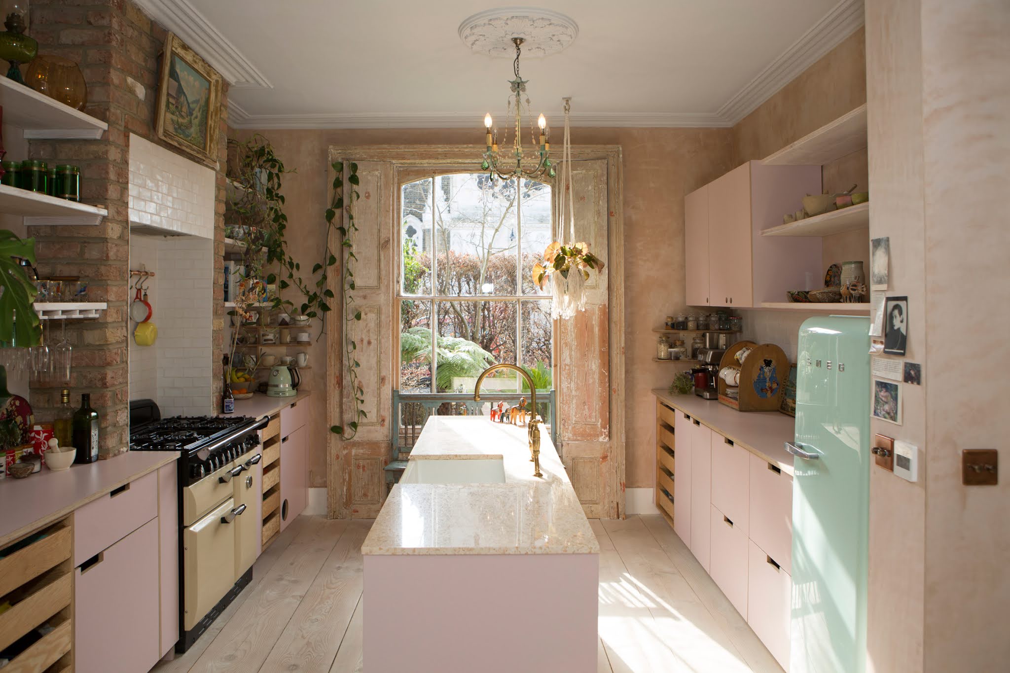
    Inspired by this stopped-dead-in-my-tracks pink living room, today I find myself on the Farrow and Ball paint website, on the hunt for a specific shade of pink. Something that falls into the no longer a blush, not yet a mauve category. And then I see it…No. 295, Sulking Room Pink. Although the living room shade I am after might be closer to No. 246, Cinder Rose, it is no longer a shade specific expedition, it has become an entire interior analysis. The sulking room. 

The aforementioned living room via The Modern House 


Images & Colors via Farrow & Ball

    
According to a dive into Google searches, the sulking room is another name for the boudoir. Traditionally a woman’s small siting room or salon that separates the bedroom from the rest of the house, the term boudoir derives from ‘bouder’ the French verb meaning ‘to sulk or pout.’
 I can't say it isn't fun to imagine myself as a 19th Century Parisian Socialite getting home after a long hard morning of enjoying the newfound freedoms for women in modern Paris. I return from a very stressful trip to Le Bon Marché in which I failed to find the perfect table linens for my upcoming soirée and swish my skirts behind me as I stomp to my perfectly powder pink boudoir to put my feet up on my velvet chaise and lament the elusive tablescape. Sacré bleu! Whatever shall I do? The party is in less than a month! 


    Despite this practice of historically fictional daydream, I also think that the idea of the sulking room has its modern incarnations. To me these days sulking is not limited to the boudoir, all of my rooms are my sulking room. I recently graduated from college and am only part-timely employed and living with my parents; I would use the word ‘sulking’ to describe my daily routine really. I’m working on it. 


    The first thing that lit up in my brain/file cabinet when I saw this color was the Baltimore home of Annie Reed in Sleepless in Seattle. Annie’s kitchen and living room are painted an amazing shade of leftover-from-the-80's pink that’s fit for any bachelorette pad. I feel like what goes on inside this interior world of the Rom-Com Universe carries on the spirit of the sulking room. Annie’s kitchen and living room set the scene for late night movie watching with best friends, frantic phone calls…and writing letters to long distance radio crushes… Anyway, unrelatable plot lines aside, this space acts as a place of respite that contrasts the workplace, the restaurant, and the awkward holiday dinner party in which lamentations of life’s little inconveniences can be expressed without regulation, alone or with others, and incubates the lifelines of commiseration, friendship, and after a suitable amount of time even nourishes schemes to end the season of sulking and just get on with it.


    Much like Meg Ryan in any of her movie interiors, every modern woman needs a place to sulk. Especially in "these times" during which most other meeting places have become inaccessible, cafe culture is currently off the table and winter threatens to encroach on the outdoor rendezvous spots we have created, the home is reinforced as sanctuary, social club (zoom movie night anyone?), and headquarters for getting your life together. Maybe for you that takes the form of this enviable pink concrete conversation pit/kitchen extension that is the perfect combination of modernist and kitsch. I could definitely see myself in the middle of an existential episode crying to the end of My Best Friend’s Wedding on that built in sofa. There may not be sex, there may not be marriage, but by god there will be dancing!!!!


The conversation pit...a whole other topic of interest 
Images via The Nordroom


    Or maybe your sulking room transcends beyond the color that has sent me into this headspace today. Whether its pink or gray or blue or wallpapered, long live the sulking room! I imagine all you really need is someplace nice to sit and maybe some dim ambiance lighting in order to create a space where its okay to feel sorry for yourself for a bit. After all, c’est la vie. 


-Kate